메가박스 사이트 따라 만들기 - 영화 차트 슬라이더 반응형

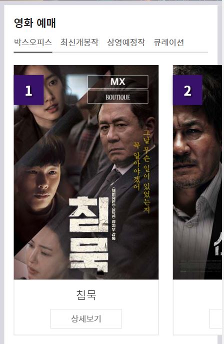
영화 차트 이미지 슬라이드 반응형
모바일에서도 원활히 볼 수 있도록 디바이스 크기에 따라 조절합니다.
결과
style.css
@media (max-width: 960px) {
  .movie_title ul {
    width: auto;
  }

  .movie_title li {
    width: 25%;
    box-sizing: border-box;
  }
}

@media (max-width: 768px) {
  body {
    background: #d9d7e0;
  }

  #movie .row {
    background: #fff;
    margin: 24px;
    padding: 24px;
  }

  #movie .ir_so {
    position: static;
    width: auto;
    height: auto;
    line-height: normal;
    text-indent: 0;
    font-size: 24px;
    font-weight: bold;
    padding-bottom: 20px;
  }

  .movie {
    padding: 0;
  }

  .movie_title {
    margin-bottom: 30px;
  }

  .movie_title ul {
    position: relative;
    padding-bottom: 10px;
  }

  .movie_title ul:before {
    content: '';
    position: absolute;
    z-index: 1;
    bottom: 0;
    width: 100%;
    height: 2px;
    background: #e1e1e1;
  }

  .movie_title li {
    width: auto;
    border: 0;
  }

  .movie_title li a {
    position: relative;
    font-size: 18px;
    color: #666;
    font-weight: 400;
    margin-right: 35px;
    padding: 0;
  }

  .movie_title li.active a:before {
    content: '';
    position: absolute;
    z-index: 2;
    left: 0;
    bottom: -10px;
    width: 100%;
    height: 2px;
    background: #666;
  }

  .movie_title li.active a {
    background: none;
    color: #666;
  }
}

@media (max-width: 600px) {
  #movie .container {
    position: relative;
  }

  #movie .container:after {
    content: '';
    position: absolute;
    z-index: 20;
    top: 0;
    right: 0;
    width: 8px;
    height: 100%;
    background: #d9d7e0;
  }

  #movie .row {
    position: relative;
    margin: 8px;
    padding: 16px;
    margin-right: 0;
    padding-right: 0;
  }

  #movie .row:after {
    content: '';
    position: absolute;
    top: 0;
    right: 0;
    z-index: 10;
    width: 24px;
    height: 100%;
    background-color: #fff;
  }

  #movie .ir_so {
    font-size: 18px;
    padding-bottom: 10px;
  }

  .movie_title {
    margin-bottom: 20px;
  }

  .movie_title ul {
    padding-bottom: 8px;
  }

  .movie_title li a {
    font-size: 14px;
    margin-right: 15px;
  }

  .movie_title li.active a:before {
    bottom: -8px;
  }

  .movie_chart {
    position: relative;
    z-index: 30;
  }

  .movie_chart>div>div>div .infor {
    padding: 5px;
  }

  .movie_chart>div>div>div .infor h3 {
    text-align: center;
    margin: 5px 0 10px;
  }

  .movie_chart>div>div>div .infor h3 strong {
    display: block;
    font-size: 19px;
    color: #222;
    font-weight: 300;
  }

  .movie_chart>div>div>div .infor h3 span {
    display: none;
  }

  .movie_chart>div>div>div .infor .infor_btn a {
    width: 52%;
    margin-left: 24%;
    display: block;
    margin-right: 0;
    padding: 5px;
    color: #777;
    margin-bottom: 5px;
    box-sizing: border-box;
    font-size: 14px;
    background: none;
    border: 1px solid #ddd;
  }

  .movie_chart>div>div>div .infor .infor_btn a:last-child {
    display: none;
  }
}

@media (max-width: 320px) {
  .movie_title li a {
    margin-right: 9px;
  }
}
js
//영화차트 이미지 슬라이드
var swiper = new Swiper(".swiper-container2", {
  breakpoints: {
    600: {
      slidesPerView: 1.4,
      spaceBetween: 24,
    },
    768: {
      slidesPerView: 2,
      spaceBetween: 24,
    },
    960: {
      slidesPerView: 3,
      spaceBetween: 24,
    },
  },
});
출력
width: 960px

width: 768px

width: 600px

'공부 > 메가박스 사이트 따라만들기' 카테고리의 다른 글
| 메가박스 사이트 따라 만들기 - 오프닝 영역 (0) | 2022.02.13 |
|---|---|
| 메가박스 사이트 따라 만들기 - 이벤트 영역 (0) | 2022.02.13 |
| 메가박스 사이트 따라 만들기 - 영화 차트 슬라이더 (0) | 2022.02.13 |
| 메가박스 사이트 따라 만들기 - 영화 차트 탭 (0) | 2022.02.13 |
| 메가박스 사이트 따라 만들기 - 영화 차트 구조 (0) | 2022.02.13 |