공부/메가박스 사이트 따라만들기
메가박스 사이트 따라 만들기 - 배너 반응형
KDONG
2022. 2. 13. 16:13

배너 반응형
아래의 글이 위의 글과 너무 떨어져 있을 경우 위의 글에 line-height값을 줄여줍니다.
https://fontawesome.com/사이트에서 소스를 다운받아 아이콘을 사용할 수 있습니다.
Font Awesome
The world’s most popular and easiest to use icon set just got an upgrade. More icons. More styles. More Options.
fontawesome.com
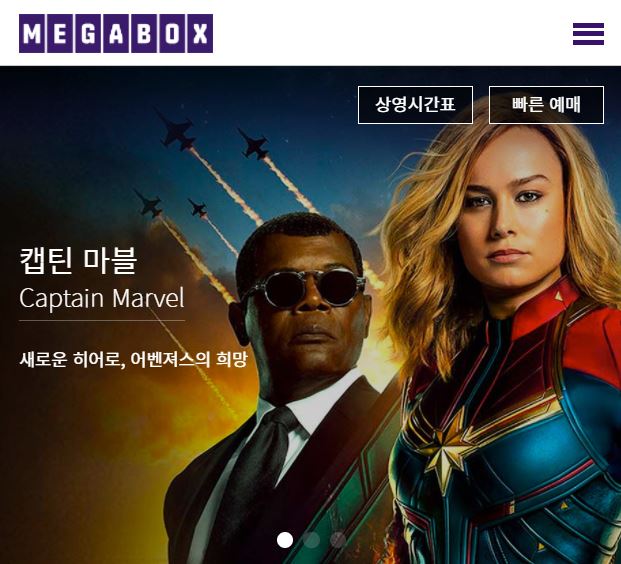
결과
HTML
<div class="bm_left">
  <ul>
    <li class="total"><a href="#"><i class="fa fa-bars" aria-hidden="true"></i>전체메뉴</a></li>
    <li class="line"><a href="#">필름 소사이어티</a></li>
    <li><a href="#">클래식 소사이어티</a></li>
  </ul>
</div>

<div class="swiper-wrapper">
  <div class="swiper-slide ss1">
    <div class="container">
      <div class="row">
        <h2>캡틴 마블 <em>Captain Marvel</em></h2>
        <p>새로운 히어로, 어벤져스의 희망</p>
      </div>
    </div>
  </div>
  <div class="swiper-slide ss2">
    <div class="container">
      <div class="row">
        <h2>캡틴 마블 <em>Captain Marvel</em></h2>
        <p>새로운 히어로, 어벤져스의 희망</p>
      </div>
    </div>
  </div>
  <div class="swiper-slide ss3">
    <div class="container">
      <div class="row">
        <h2>캡틴 마블 <em>Captain Marvel</em></h2>
        <p>새로운 히어로, 어벤져스의 희망</p>
      </div>
    </div>
  </div>
</div>
style.css
.slider .swiper-slide h2 {
  position: relative;
  display: inline-block;
  font-size: 62px;
  line-height: 70px;
  color: #fff;
  margin-top: 200px;
}

.slider .swiper-slide h2 :after {
  content: '';
  width: 100%;
  height: 1px;
  background: rgba(255, 255, 255, 0.3);
  position: absolute;
  left: 0;
  bottom: -35px;
}

.slider .swiper-slide h2 em {
  display: block;
  font-size: 59px;
  font-weight: 100;
}

.slider .swiper-slide p {
  font-size: 27px;
  color: #fff;
  padding-top: 55px;
}

@media (max-width: 1024px) {
  #mNav {
    display: block;
  }

  .nav {
    display: none;
  }

  .row {
    padding: 0 24px;
  }

  .header h1 {
    float: none;
    text-align: center;
  }

  .header h1 strong {
    left: 24px;
  }

  .banner_menu .bm_left ul {
    display: none;
  }

  .banner_menu .bm_right ul:first-child {
    display: none;
  }
}

@media (max-width: 960px) {
  .slider {
    height: 500px;
  }

  .slider .swiper-slide h2 {
    margin-top: 170px;
    font-size: 37px;
    line-height: 45px;
  }

  .slider .swiper-slide h2 :after {
    bottom: -15px;
  }

  .slider .swiper-slide h2 em {
    font-size: 34px;
  }

  .slider .swiper-slide p {
    font-size: 16px;
    padding-top: 35px;
  }
}

@media (max-width: 768px) {
  .row {
    padding: 0 16px;
  }

  #mNav {
    right: 6px;
  }

  .header h1 {
    text-align: left;
  }

  .header h1 strong {
    display: none;
  }
}

@media (max-width: 600px) {
  .slider {
    height: 400px;
  }

  .slider .swiper-slide h2 {
    margin-top: 140px;
    font-size: 24px;
    line-height: 30px;
  }

  .slider .swiper-slide h2 :after {
    bottom: -5px;
  }

  .slider .swiper-slide h2 em {
    font-size: 20px;
  }

  .slider .swiper-slide p {
    font-size: 14px;
    padding-top: 25px;
  }

  .banner_menu {
    top: 16px;
  }

  .banner_menu .bm_right li.white a {
    font-size: 14px;
    padding: 3px 5px 5px 5px;
    color: #fff;
    background: rgba(0, 0, 0, 0.6);
    border-color: #fff;
  }

  .banner_menu .bm_right li.purple a {
    font-size: 14px;
    padding: 3px 5px 5px 5px;
    color: #fff;
    background: rgba(0, 0, 0, 0.6);
    border-color: #fff;
  }

  .swiper-pagination-bullet {
    width: 13px !important;
    height: 13px !important;
  }
}
출력